Key Takeaways
- The Light Phone 3 is moving closer to traditional smartphones with new features like an OLED screen and cameras.
- Light’s goal is to offer more options in the smartphone market while maintaining a focus on reducing distractions.
- The company adheres to principles like no ads, no infinite feeds, and ensuring actions on the phone have a clear ending.
Smartphones have long been pitched as digital multitools — screens that can fit in your pocket and are capable of whatever app is open currently. That flexibility, combined with the general truism that a phone is easier to use than a computer, has proved to be wildly popular. Somewhere along the way, though, smartphones also became the place where everything happens.
You might have heard the criticisms before: They demand our attention with notifications, they waste our time with endless feeds, and they’ve reshaped how we interact with people and ideas. Whether or not you agree, enough people have felt weird about their relationship with their phone to do something about it — cutting down on the use of the phone they already have, switching to a “dumbphone,” or building an alternative option altogether.
The Light Phone and the company behind it, Light, launched on Kickstarter in 2011 as the simplest, distraction-free, second phone option. Light Phone 2, released in 2019, took things further with an E Ink display and several simple apps, like a music player and navigation. And with the Light Phone 3, Light is moving beyond some of the simplicity of its previous phones, with a new display, a replaceable battery, and, for the first time, a built-in camera. Here’s how the company has approached those changes while maintaining respect for your attention and peace of mind.
Related
The best fitness rings for distraction-free health tracking
Fitness rings let you monitor your health without introducing another screen into your life.
The Light Phone 3 is a step up from its predecessor
Inching closer to a traditional smartphone experience
Light / Pocket-lint
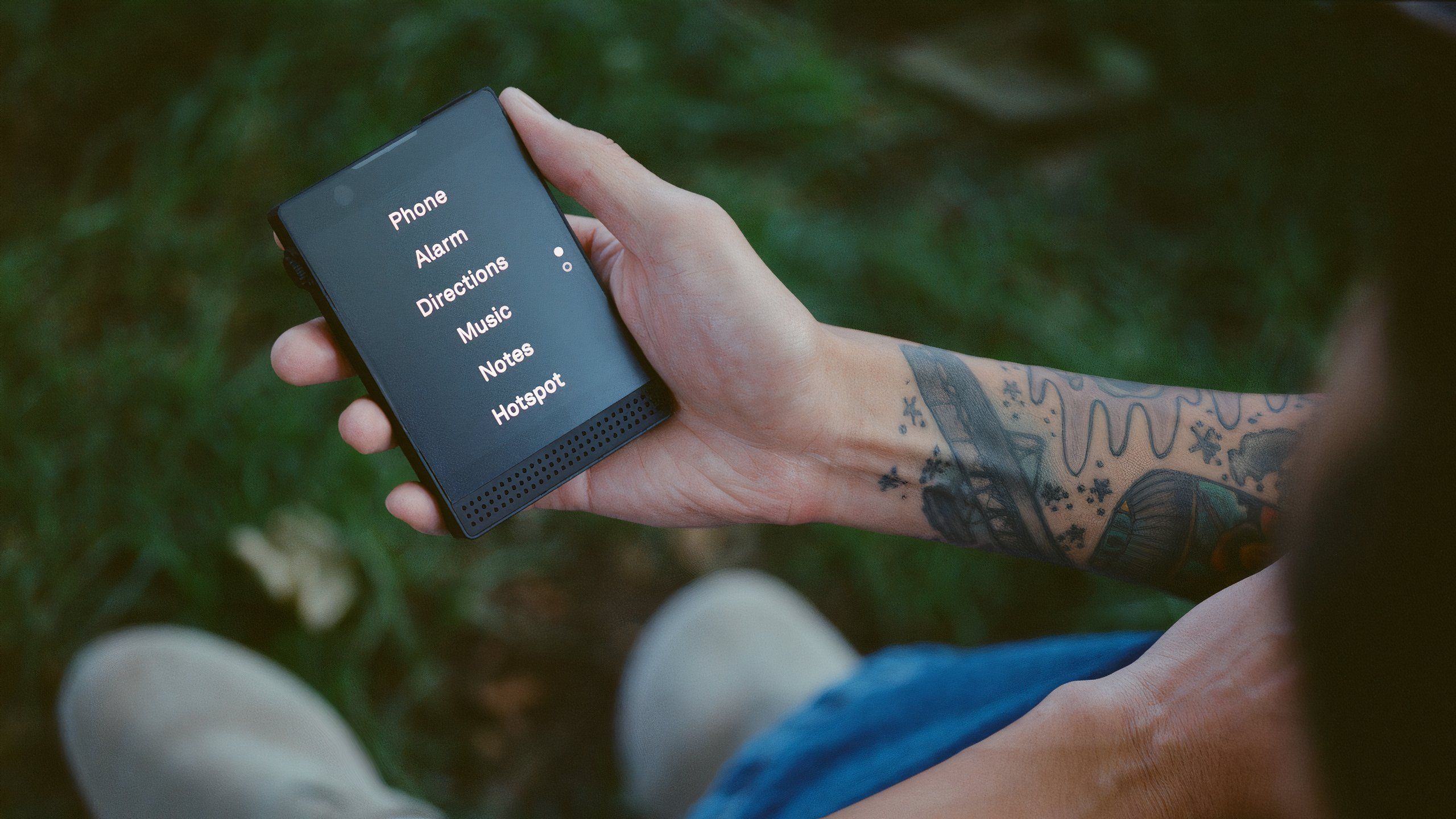
The differences between the Light Phone 2 and the Light Phone 3 are obvious when you see them side by side. Light’s second phone, and the first that customers could use as their primary device, is tiny by 2024 phone standards.
It’s the size of some credit cards stacked on top of each other, with a curved back and a 2.8-inch display that’s easy to reach with a single thumb. Sure, it supports a 4G connection, text messages, and calls, along with a limited number of apps, but it’s all through a simple, primarily text-based interface called Light OS.
The phone’s E Ink screen displays everything in black and white on the black model of the Light Phone 2, or gray and black on the gray model. E Ink displays are inherently slower and more deliberate than the LCD or OLED screens you’ll find on most smartphones. They take time to refresh and sometimes even feature an afterimage of what they displayed before — an effect called “ghosting.”
Light / Pocket-lint
The tools currently available on the Light Phone 2: Alarm, Timer, Directions (turn-by-turn navigation), Directory (for looking up addresses), Music Player (with support for one playlist), Notes / Voice Memo, and Podcasts.
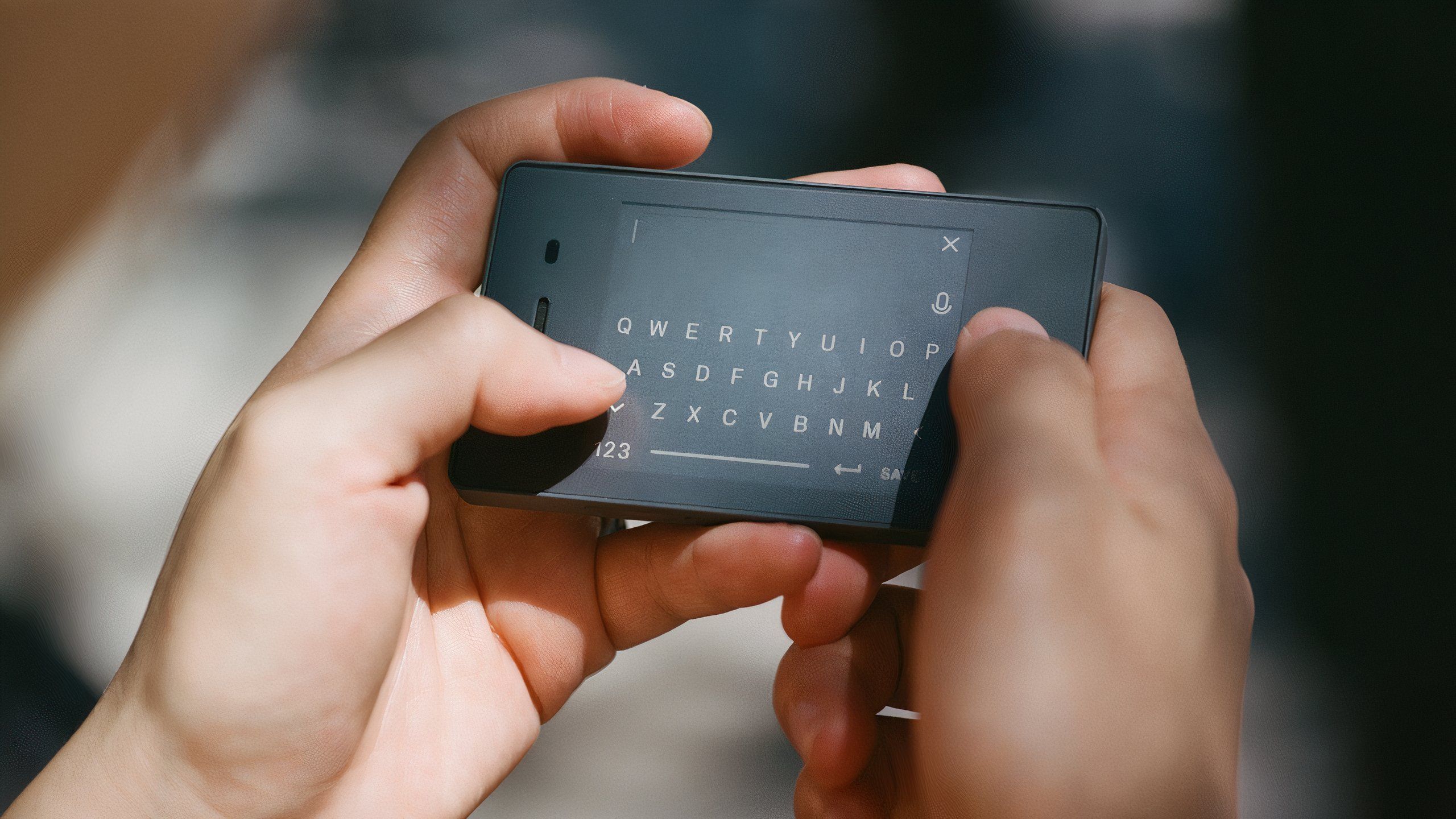
The Light Phone 3, in comparison, is boxy. It’s closer to the size of your wallet, with prominent aluminum buttons (including a dedicated shutter button), large grilles on the front for speakers and a microphone, and a larger, matte OLED display. The Light Phone 3 has more of the ingredients of a traditional smartphone, though keeping up with the screens on the iPhone 15 wasn’t Light’s motivation.
“I think if you zoom out, it wasn’t the type of display,” Light’s CEO and co-founder Kaiwei Tang tells me over a video call. “Technology was not the main driver of what we’re trying to do.” The goal with this third Light Phone was to make the idea of going “light” comfortable for more people.
“A lot of users just couldn’t get used to it, even our own investors couldn’t get used to the E Ink display,” Tang says. Switching to an OLED treated to be as matte and glare-free as an E Ink display was the answer. Not only did it make using the device less frustrating for anyone used to the speed and responsiveness of a normal smartphone, but it also made design features for Light OS a little simpler because Light’s software team didn’t have to tweak the display’s refresh rate and animations around E Ink.
Light doesn’t intend to end support for the Light Phone 2, though. “We’re not a fan of planned obsolescence,” Tang says. “All the products we create, we will support until no one wants them.” The company plans to bring every new software feature added to the Light Phone 3 back to the Light Phone 2, hardware permitting.
The point of a third Light Phone is really to offer more options. “It’s like different shoes or different cars. You choose the right tool for the job,” Tang says. The Light Phone 3 can do more from the start, but it’s still not the time-suck of a traditional smartphone. It’s just a baby step forward in capability from the utilitarianism of the Light Phone 2 — more Blackberry to the Light Phone 2’s Nokia, rather than the huge leap forward of the iPhone.
A camera inspired by point-and-shoots
Light / Pocket-lint
Besides the display, the other addition making the Light Phone 3 more palatable to the average smartphone user is its cameras. Light didn’t make the decision to add cameras without some serious thought.
“We don’t have a camera on the Light Phone 2 because we were feeling like the activities around cameras are such a distraction,” Tang says. “The posting, the commenting, you take a photo and you start reviewing it… I think that’s a distraction.”
But that doesn’t change the fact that people like taking photos, and having a way to document a moment is useful. Light thinks of the cameras (front and rear) on the Light Phone 3 as a “tool to supplement a moment.” It’s for documenting things you want to save, like a receipt, and sharing images of something that matters, like a video of you and your kids, directly with your friends and family. No feeds, no comments, and no network effects. Light isn’t even sure if it wants to have any kind of gallery for viewing photos and videos on the Light Phone 3.
“We’re still thinking whether or not we want to create some kind of gallery,” Tang says. “Maybe with a limit, like 24 hours or something like that, so you could review them, but that’s TBD.” Whatever happens, the company plans on making everything you capture available on its web dashboard, where you currently go to manage things like your RSS feeds for Light OS’s podcast tool.
And if having a dedicated shutter button didn’t make it obvious, the big inspiration for the camera isn’t the computational wizardry of a device like the Pixel 9. “We’re not going to make it fancy and try to do a lot of software tweaking. It will be just like your point-and-shoot camera,” Tang says.

Related
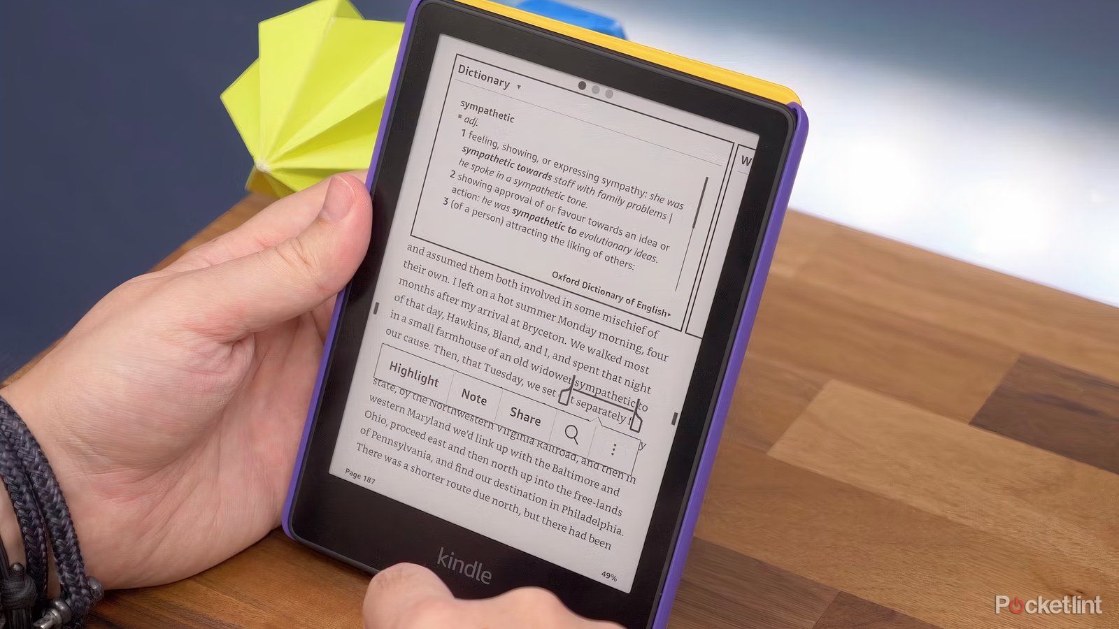
Best eReaders: Upgrade your print book library for greater storage and accessibility
The best eReaders are waterproof, easier on your eyes and can save you valuable shelf space with fantastic digital storage options.
Every action should have a clear beginning and end
The analogy Tang returned to throughout our conversation was a hammer. A smartphone is a hammer — it’s for getting a specific job done, and then it goes away.
It just so happens that a smartphone can do multiple jobs, but that doesn’t mean it deserves to dominate your attention. Light “prides [itself] on being a radically different technology company that doesn’t profit from users’ engagement,” Tang says.
To be more specific about how the company thinks about its products, Tang offered these principles: “We have big principle number one — no ad placement. Number two — no infinite feeds, nothing to browse, nothing to ‘discover.’ And number three — the action that users take has a clear ending.” The example Tang gave me was getting directions. You might start up the navigation tool and start receiving directions. Once you get to your desired location, your phone goes away. There are no other apps to check, not even obvious map locations to click on or get drawn to.
As long as features fit into those basic criteria, whether it’s new software for Light OS or hardware on the next phone, Light is comfortable considering them. The same considerations were applied to the cameras and a piece of currently unused hardware — an an NFC antenna. Light hasn’t built it yet, but the company is planning a “future payment tool” so you can go out and about with the Light Phone 3 without your wallet.
The action that users take has a clear ending.
On the whole, Light feels it’s still striking the right balance between making phones more useful and sticking to its principles. It helps that in the last few years, some segments of the public have identified the same kind of anxiety around phone use that Light was founded on.
“If you build a product because of a technology breakthrough and forget about us, our feelings, our goals, and our well-being, people are going to revolt,” Tang says. “Seeing more conversations, more press, more people joining us every year, it’s validation of that theory.” And as reporting has shown, the move to change how we think about phones hasn’t exclusively been driven by people who grew up without them. “The most surprising thing to me was that most of our users are young, are 20 to 35 years old,” Tang says.
“The new generation who was born to smartphones, social media, and the internet, they seem to have an easier time saying, ‘OK, this TikTok thing is making me feel horrible,'” Tang says. Caring about what you do and don’t interact with on your phone isn’t a bad thing. “You want something that’s curated and meaningful,” Tang says. The hope is that the Light Phone 3 will make it easier for people to make more of those meaningful choices — or at the very least, think more about the phone they already have.
Trending Products

Cooler Master MasterBox Q300L Micro-ATX Tower with Magnetic Design Dust Filter, Transparent Acrylic Side Panel, Adjustable I/O & Fully Ventilated Airflow, Black (MCB-Q300L-KANN-S00)

ASUS TUF Gaming GT301 ZAKU II Edition ATX mid-Tower Compact case with Tempered Glass Side Panel, Honeycomb Front Panel…

ASUS TUF Gaming GT501 Mid-Tower Computer Case for up to EATX Motherboards with USB 3.0 Front Panel Cases GT501/GRY/WITH Handle

be quiet! Pure Base 500DX ATX Mid Tower PC case | ARGB | 3 Pre-Installed Pure Wings 2 Fans | Tempered Glass Window | Black | BGW37

ASUS ROG Strix Helios GX601 White Edition RGB Mid-Tower Computer Case for ATX/EATX Motherboards with tempered glass, aluminum frame, GPU braces, 420mm radiator support and Aura Sync

CORSAIR 7000D AIRFLOW Full-Tower ATX PC Case â High-Airflow Front Panel â Spacious Interior â Easy Cable Management â 3x 140mm AirGuide Fans with PWM Repeater Included â Black


